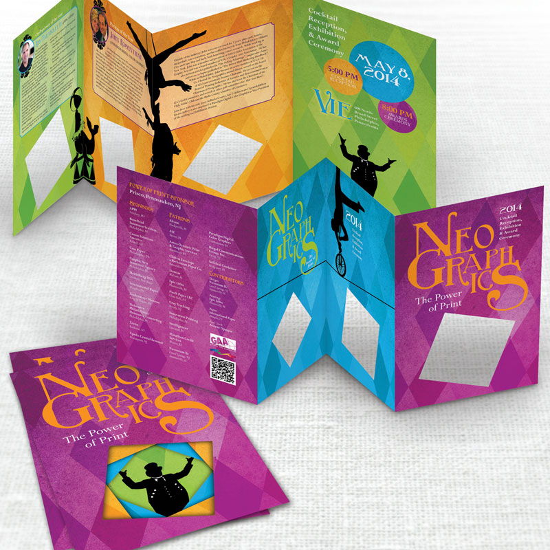
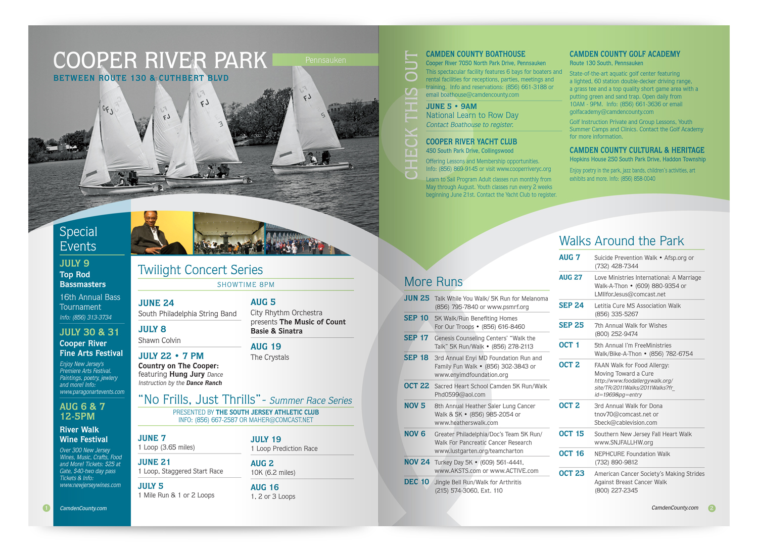
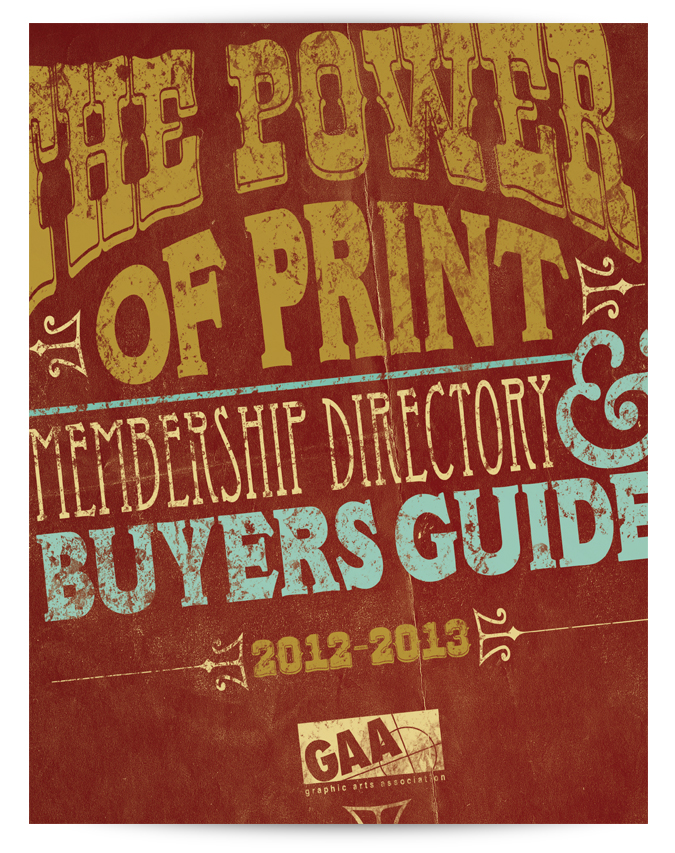
A celebration of print

Neographics is an awards event dedicated to recognizing and rewarding the quality and service that is provided by the graphic communications, packaging and converting industries to their worldwide customers.

Each year a new theme is chosen. For 2014, GAA chose circus and the challenge was to embrace the theme, but keep it classy enough to carry this prestigious event.

As lead designer on this, the decision was made to incorporate several print techniques to emulate the kinds of projects the awards program highlights. Die cutting, spot UV and spot soft touch processes were incorporated into the final designs.

Client:
Graphic Arts Association
Philadelphia, PA
Category:
Art Direction
Lead Design
Team: Nuvonium
 
Neo2014-banner.jpg
Neo2014-invite.jpg
Neo2014-entry.jpg
Neo2014-Poster.jpg

Beautiful and practical design on a shoestring

BoBeesa Artisan Pasta is a small start up company which sells their pasta creations from their kitchen to farm markets in the Austin, TX area. Their name was taken as a tribute to a lost family member, whose love of music, nature, all things organic and her Italian heritage stands as the inspiration of the brand.

The challenge for the packaging of the product is not only budget, but also it had to be versatile enough to accommodate new flavors of pasta. The flavors and recipes are driven by the organic ingredients which are purchased fresh from the market every week.

For this design I decided to create a label which would be applied to a simple and elegant paper bag package. The labels were sized and laid out so that they could be printed digitally via a local short run printer, then applied by hand. The design utilizes a handwritten font which can be push, pulled and squashed to accommodate any given name, still be legible and remain true to the design.

Client:
BoBeesa Artisan Pasta
Phlugerville, TX
Category:
Art Direction
Lead Design
Team: Self
 
Bobeesa-facebook.jpg
BoBeesa-logo.jpg
Bobeesa-Package.jpg
BoBeesa-Tortelini.jpg
BoBeesa-Scene1.jpg

The shore sucks...get a pool.

Swim-mor is a family owned South Jersey-based company specializing in pool construction, as well as existing pool renovations and modernizations. 

In the 2014 summer ad series for Swim-Mor we focused on the benefits of having a place to enjoy summer fun in your own back yard rather than battling typical annoyances, fears and costs for going down the shore.

Client:
Swim-mor Pools
Mt.Ephraim, NJ
Category:
Art Direction
Lead Design
Team: Nuvonium
 
swimmor-ad-sand.jpg
swimmor-ad-nosharks.jpg
swimmor-ad-keep-swimming.jpg

Ancient but new

Secrets of Tea is a small, family owned craft tea blender. Their teas are based on family remedy recipes that are passed down from one generation to the next. As lead designer it was my responsibility to come up with a mark that perfectly blended the heritage of these ancient recipes with a feel for the modern tea movement.

The original concept packaging (shown below) would be in paper tube which was later changed to a tin for economic reasons. It was decided that the teas would be marketed in categories; using color as the differentiator. As lead designer I chose to use bright colors, textures and patterns to help enforce the Asian heritage of the teas, but placed into a simple clean design to modernize it as well as keep them flexible for adding new future flavors and recipes.

Client:
Secrets of Tea
New York, NY
Category:
Lead Design
Team: Nuvonium
 
SOT-logo2.jpg
SOT-package-concept.jpg
SOT-package-concept2.jpg

Every luxury kitchen needs one

AGA ranges are a luxury cooking brand that dates back to the early 18th century from Coalbrookdale, UK. Owners typically become proud and fanatical “Aganauts”, a society of epicureans that boast the cookers’ supreme talent for generating better tasting, more nutritious food and its exceptional endurance in the kitchen.

As art director and lead designer I was responsible for creating customer brochures for their ranges and Legacy line. The brochures needed to communicate the upscale nature of the product and highlight their functionality as well as their beauty. The designs were created so that they would work in tandem with each other as well as stand apart.

Client:
AGA Ranges
North America
Category:
Art Direction
Lead Design
Team: jldcreative
 
AGA-cover.jpg
 
AGA-image.com
aga-range-spread1.jpg
aga-range-spread2.jpg

aga-legacy-cover.jpg
 
aga-legacy-image.jpg
aga-legacy-spread1.jpg
aga-legacy-spread2.jpg

Breathing new life into old things

Duke & Damsel is a Etsy based shop owned and operated by Rachael Vitale and Kevin Katz. They find and restore furniture to not just an original state but to something entirely new.

For their logo design I was inspired by the mid-century restorations which make up a large part of their inventory. The color palette, typography, and even the stylized chair mark, harken to a time when beehives and bobby socks were all the rage.

Client:
Duke & Damsel Furniture Co.
Mt. Laurel, NJ

Category:
Art Direction
Lead Design

Team: Self

DD-logo-reverse.jpg
dd-logo.jpg
DD-desk.jpg
DD-dresser.jpg
DD-high-boy.jpg

Community entertainment

Camden County lies just across the water from Philadelphia. The county is peppered with a variety of community parks and open spaces. Each year the parks division of the board of freeholders publishes an events guide which highlights all of the entertainment the county provides as free entertainment.

As lead designer & director, I and the jldcreative team had the honor of designing the self mailing brochure for several years running. The concept for 2012 presented the vast amount of information in a clean layout and in a smaller 7 x 10 format which saved on mailing costs. The design layout also utilize the county branding to highlight each park and their respective events.

Client:
Camden County Parks
Cherry Hill, NJ

Category:
Art Direction
Lead Design

Team: jldcreative

ccparks-cover.jpg
 
ccparks-orchestra.jpg
boat.jpg
ccparks-spread.jpg

Trade show show-off

Graphisoft are the creators of ArchiCAD a BIM program for architects and interior design professionals to visualize projects in 3D. Gaphisoft attends several trade shows every year. For smaller shows they wanted a simple pop up display they could have work stations in front of to display the program for trade show attendees.

As lead designer and director the design chosen was fairly simple so as not to distract from the display stations. A simple abstract of a building and grid squares to emulate the building blocks on a pop up display designed for a 10 x 20 booth space. The branding is prominently displayed to make it easy to see and find on the trade show floor.

Client:
Graphisoft
North America
Category:
Art Direction
Lead Design
Team: jldcreative
 
graphisoft-display1.jpg
graphisoft-display2.jpg

Printing for printers

The GAA (Graphic Arts association) is a regional trade association for the print industry. They provide business relationships, expertise and education that ensure the strength and profitability of member companies in the DE, PA and NJ areas. The membership directory has information pertaining to their services as well as a listing of all the members to promote member to member networking.

As lead designer and director of this project this concept presented took its cues that harken back to the beginning of print and the letterpress. The front end of the book is a full color guide for members and the back end contained the membership listing, printing only in black. The extensive membership listing would be the majority of the book and print perfect bound due to its size.

Client:
Graphic Arts Association
Trevose, PA
Category:
Art Direction
Lead Design
Team: Nuvonium
 
 
GAA-image.jpg
GAA-directory-cover.jpg
GAA-directory-spread1.jpg
GAA-directory-spread2.jpg